MOBILE X ENTERPRISE
MobileX goes beyond basic mobile optimization, offering the full CAD experience with responsive design to both Android and iOS platforms. Get a powerful way to use phones and tablets in the field without giving up functionality.
PROJECT OVERVIEW
Giving first responders access to information on any device in the field, enhancing agility and cost savings
CentralSquare Technologies MobileX Enterprise is a mobile solution that provides first responders with access to information on any device in the field. It is a fully optimized CAD experience for handheld Android and iOS devices, with features such as mobile mapping, intelligent routing, real-time alerts, and compatibility with Samsung DeX/docking system - for a desktop-like experience. It is designed to work on all platforms and offer the full functionality of Mobile CAD Enterprise. MobileX is designed to function how first responders react and respond to complex and evolving events. Responders see the most critical data, enabling them to focus on the situation at hand, with a direct line of communication to dispatch.
The Challenge
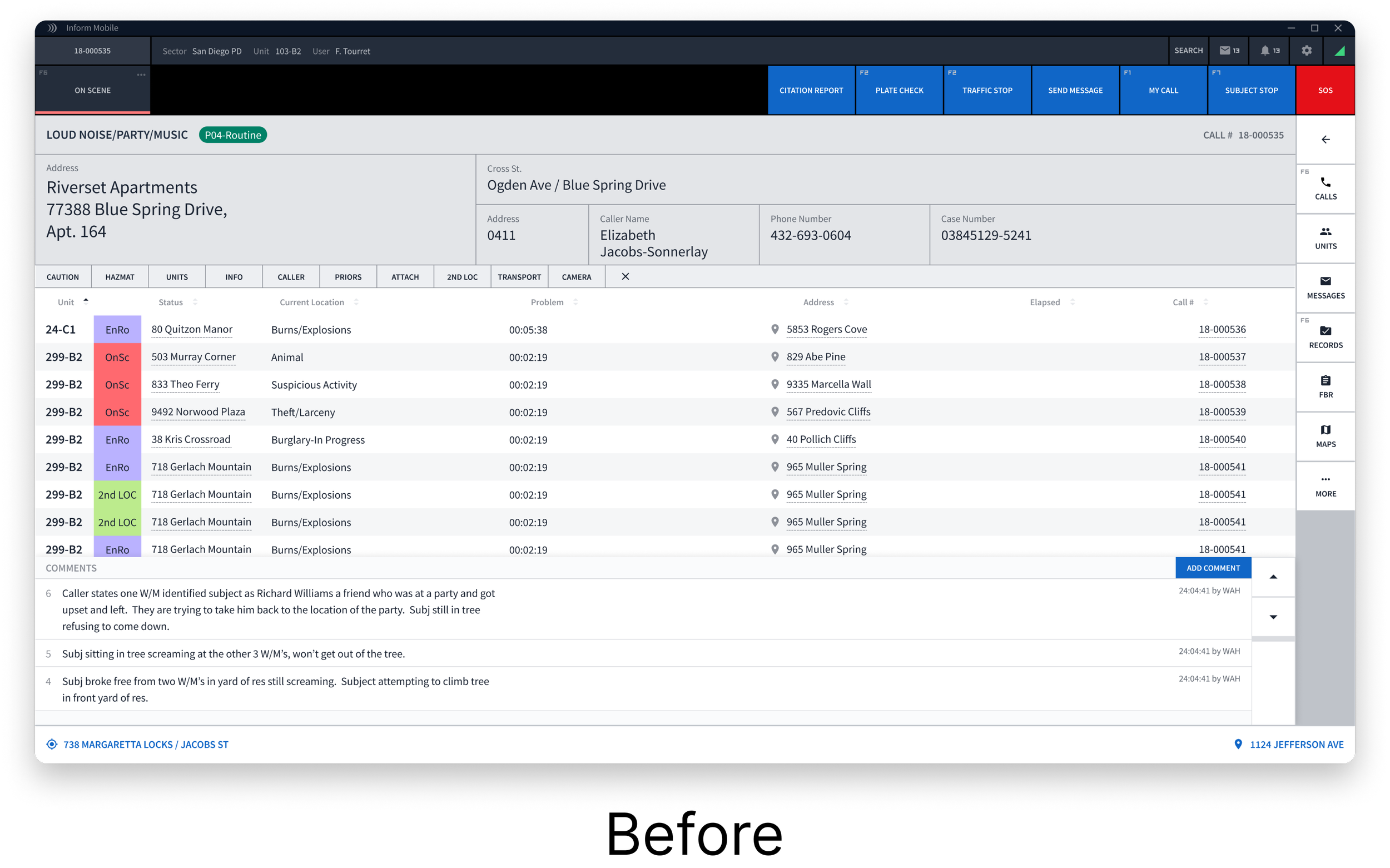
How might we design a user interface solution that maintains existing information while reducing the number of clicks, providing access to key safety information, and enhancing situational awareness for first responders before they arrive on scene.
The Outcome
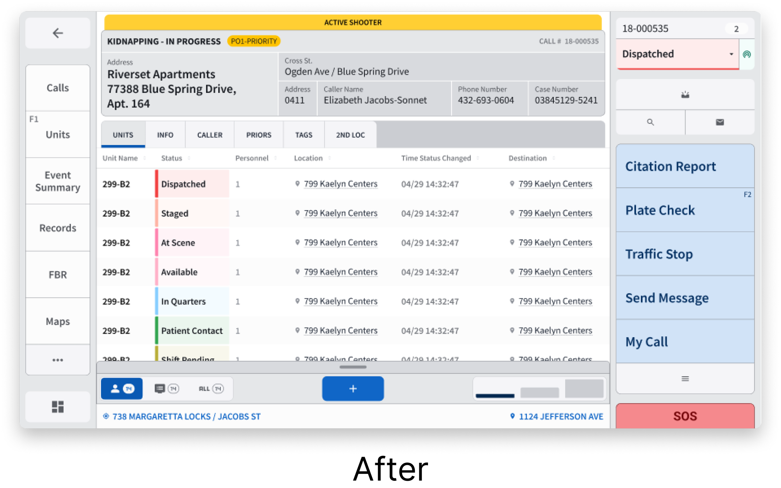
Redesigned a user-friendly interface tailored to the needs of first responders, allowing them to quickly and easily access crucial information in mission-critical situations. Our design improvements enhance both productivity and user satisfaction, giving responders the resources they need on their mobile devices.
Stakeholders
UX Design, Product Manager, Product Owner, Development
Roles & Responsibilities
UI Designer, User Research, Wireframing & Prototyping, Usability Testing, User Interviews
Tools
Figma


Our Approach
Research - 01
Identifying existing product features
In the user research phase, a combination of interviews, usability testing, and ride-alongs provided valuable insights into the needs and experiences of law enforcement officers utilizing the existing Mobile enterprise software.
Some of my responsibilities during this phase included:
Preparing design files and mockups for usability testing
Observe how first responders use our products through user interviews in the office and in the field
Gather feedback by taking notes and observing how users interact with new features and prototypes during usability tests
Additionally, we engaged in meetings with key stakeholders to gain a deeper understanding of the product's context and requirements. Key findings from this comprehensive approach revealed several critical points:
Key insights:
Interface pain points - Through observations and interviews, officers reported difficulties with small buttons, font size, and navigation issues hindering their ability to efficiently access critical information during operations. If officers had gloves on, it made it even more difficult to touch smaller buttons.
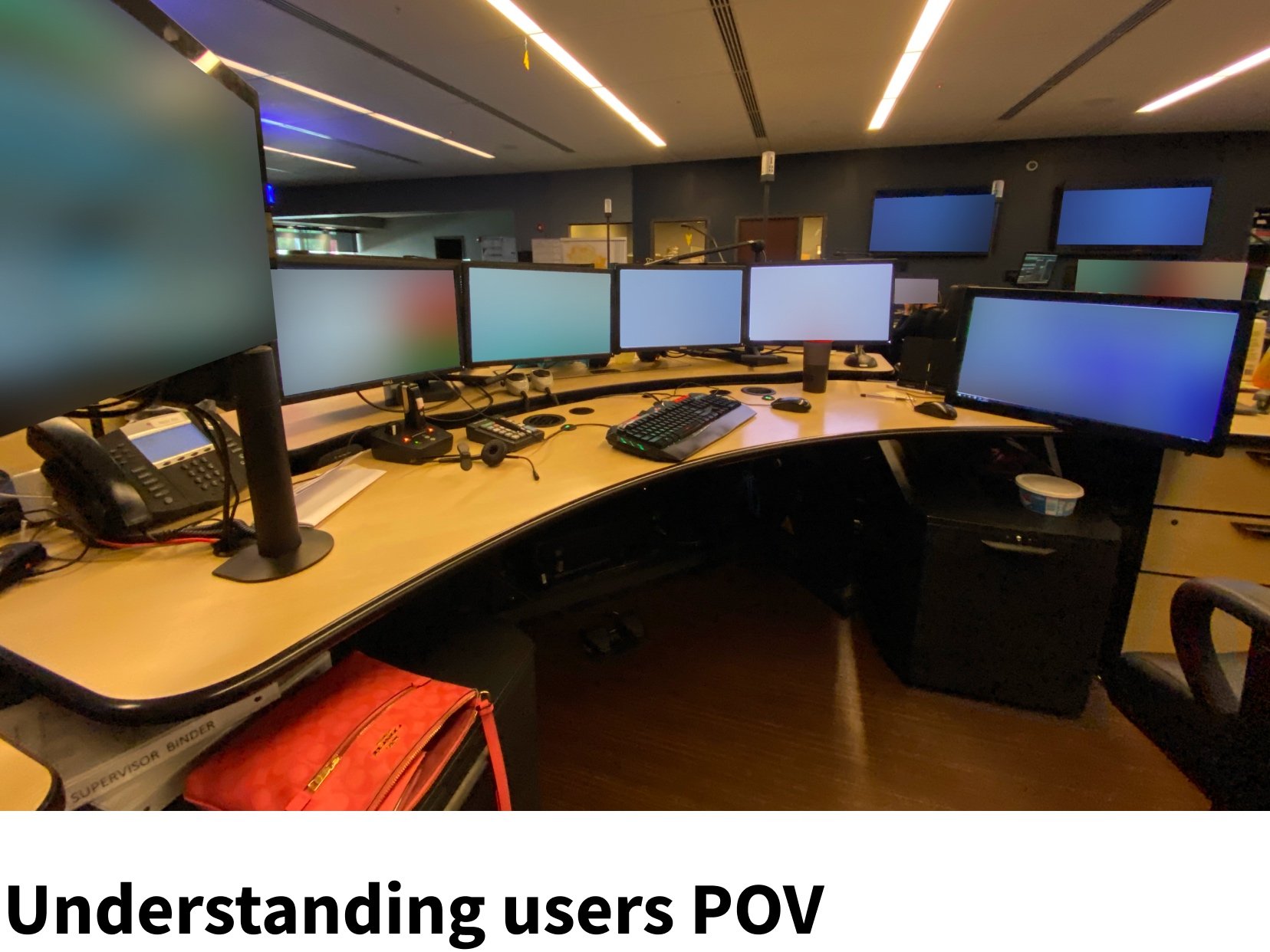
Contextual Insights - Ride-alongs offered contextual insights into officers’ workflows and operational environments. Gaining insights by closely observing how diverse users engage with our product across various situations.
Feature Prioritization - During conversations with officers about their workflow and challenges, it became essential that they have the ability to swiftly access vital information precisely in the most critical of situations.

We analyzed the existing product by meeting with our PO, talking with users, and gathering resources. We pinpointed opportunities for improvement in both usability and UI design. By diving further into how the product functions, we made it a goal to enhance user experience by making contextual information more readily accessible.

I took the opportunity to travel and go on multiple site visits, visiting a couple of agencies of varying sizes to gain insights into how our users engage with our software. Our aim was to identify strengths, areas of improvement, and gather feedback on user experiences.

To gain a genuine understanding of a first responder's daily activities, I participated in ride-alongs during actual emergency calls. This allowed me to observe firsthand how our software is utilized, the challenging environments they operate in, and how they respond in real-life situations.
Findings
Overall, gaining insight into various user types and their respective use cases across different scenarios provided us with a clearer understanding of the significance behind this requested enhancement.
Define - 02
Opportunity for improvement
Technical Constraints
Accessibility - Meeting ADA standards to make sure that we think about all users. This was particularly important for users who preferred a darker interface or those who predominantly worked during nighttime hours.
Device compatibility - Designing for both large form factor and small form factor and taking into account the information that needed to be displayed for both devices.
Technical feasibility - We were constrained to design with the existing information because of the current development of both mobile devices. Being able to unplug from one device and continue where you left off on the other.
Business needs and why this mattered
This cost reduction enables agencies to allocate more resources to meet the demands of their challenging responsibilities.
Technology plays a big role by providing first responders with more information, automation, and error-proofing their jobs.
To synthesize the insights from user research provided a fresh perspective on the situations and environments faced by first responders across various use cases. For example, a police officer responding to a traffic stop vs. a burglary or robbery call.
We compiled all the information and realized there are several areas for improvement in the current Mobile Enterprise product. We identified users’ needs and identified how we might approach resolving these needs.
Needs
Users need to be able to quickly scan and get the information that they need when it matters most
Users need to have the ability to safely and efficiently access this information in the most critical situations
The need for a dark mode that reduces eye strain and elevates the overall visual appeal and usability
How might we design a user interface solution that maintains existing information while reducing the number of clicks, providing access to key safety information, and enhancing situation awareness for first responders before they arrive on scene.
Opportunities for improvement
Redesign the existing interface
Revamp the current dark mode, which led to the creation of a new stealth mode
Ideate - 03
Design
We came up with a wide range of various ideas and iterations to tackle this problem. We started by looking at the screen as a whole and then breaking down each section into smaller pieces with revisions.
We started by identifying the amount of 'white space' available in the caller details section, which we pinpointed two areas for exploration:
Could we increase the font size without losing information
Can we reduce the size of the data fields to conserve space and potentially explore alternative design
By experimenting with different font sizes and font weights, we realized a noticeable enhancement in legibility and a balance in negative space.
We took it a step further and then looked at how we could group some of these areas that were closely related.
In doing so, we were able to maintain the existing information users needed and were used to while enhancing legibility. From here we were able to look at areas for improvement.
Wireframes
We began with quick and fast iterations by color blocking in low fidelity to explore multiple ideas. We began by focusing on the caller details, as shown above. We intentionally separated this section from the tabs because the tabs were not directly related to call details; being that the tabs were configurable. Through various iterations, we knew we could maintain the relevant information users needed with a larger font for each of the different sections we identified.
We examined the current design and identified ways to group closely related information. As a result, we divided it into the following sections:
Main navigation - favorite buttons (configurable by users, navigates to the corresponding action.
Caller details
Tabs & table
Comments (ability to filter, minimize, and expand)
Secondary navigation
Taking into account feedback and ongoing discussions with key stakeholders, we dived deeper into this approach by implementing dual navigation rails on both sides of the screen. This design facilitates quick and convenient touch interactions with your thumb, complemented by wider and taller navigational buttons.
Prototype & Test - 04
Site visit
As we progressed through iterations and collected more feedback, we conducted usability tests on both the existing interface and the new interface. Our confidence in our direction grew as we analyzed feedback and observed the performance of these designs within the vehicle.
Positive feedback
Users liked the new interface when compared to the current version
The buttons and font are much easier to see and we received very positive feedback on the navigation rail on the side
Like the ability to filter between comments
Noticeable feedback
Users would like the ability to switch between both the current and new versions if they wanted
On the current system, they were having trouble selecting the different views for comments
Ability to adjust the colors in dark mode
Revisions to be made
Some users do not have or choose not to use a trackpad with their mobile devices. The image on the left illustrates the constrained touch area when switching between comment views.
Extensive testing was conducted on the new dark mode and shown for user feedback.
As designs evolved and matured, the focus was brought towards accessibility and making sure functionality works for all mobile devices. This included things such as tab order, focus states, interactions, keyboard only, color contrast, and more.
Final Prototype
Next Steps
Gathering more research and observing how users interact with the system during actual police calls will provide valuable insights. This feedback will be able to inform iterative improvements, ensuring that designs enhance both productivity and user satisfaction.


